Mobile web design is a strategic approach to designing websites for a wide range of mobile devices, including laptops, tablets, and smartphones. Mobile web design is becoming increasingly important as more and more people are turning to their phones to browse the internet. In fact, Google has recently announced that it will begin penalizing websites that are not mobile-friendly by displaying them lower in search results.
However, creating and maintaining a mobile-friendly website can be difficult; it requires in-depth knowledge of HTML5 and CSS3, the ability to adapt content written for the standard web to a small screen size, and constant monitoring of your site to ensure that your visitors are having the best possible experience.
This page provides you with all the tools you need to create an amazing mobile web design experience for your users!
Mobile Web Design Tools
1. Gator Website Builder
Gator Website Builder has over 100 responsive website templates to choose from for an adaptive design. Anyone that subscribes to a Gator plan has access to the library of templates, as well as a intuitive website builder that makes it easy to customize the template you choose to create a unique, fully responsive website.
2. Simbla
Simbla offers 100 simple responsive website templates customers can choose from to jumpstart the web design process. For anyone just looking to build a basic website with a few pages, their templates are straightforward and responsive.
3. Colorlib
Colorlib is a resource that collects and highlights themes—both free and premium—that anyone building a website on WordPress can use. Some of the site’s blog posts specifically collect responsive themes and templates. While working with their themes will require a little more skill than using a website builder, they can provide a good starting point for building your website and can save you some money if you’re willing to commit the time to learning basic design skills.
4. ThemeForest
ThemeForest, part of Envato, offers nearly 45,000 themes and templates for people building a website with WordPress, including over 5,000 that are responsive. Their themes start at around $5, but can cost over $100 for some options. Many of the themes include reviews and ratings from past customers, so you can get some advance insights into how well they work.
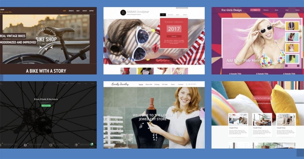
5. Templated
Templated supplies nearly 900 responsive HTML templates that are freely available under the Creative Commons. Anyone can browse their collection and download and use any template that feels like a good fit for your needs. If you’re looking for a free option to get started with, this is a good place to look first.
Tools For Doing Responsive Web Design
Responsive templates are the best option for anyone with limited skills hoping to get a website up on their own. For designers with the skills to build a website from scratch, there are a number of tools for responsive web design that make doing the job well easier.
6. Bootstrap
Bootstrap is a free, open source tool for building mobile-first responsive websites. Bootstrap provides a toolkit of the various elements you need to build a responsive website and lets you pick and choose the elements you want to include on your page to make prototyping intuitive.
7. Wirefy
Wirefy is a free tool for easily creating responsive wireframes. The tool makes it easy to plan your design around your content and make sure it looks good across device types. It requires a working knowledge of HTML and CSS, but makes the work of building a responsive site easier.
8. FitVids
If your website includes video, FitVids is a free, useful tool for ensuring your videos load at the right width on different devices. It’s a simple plugin that allows for fluid video embeds. Whatever screen size your visitors use, the videos will automatically load to the right width.
9. Adaptive Images
What Fitvids does for videos, Adaptive Images does for images. The program detects a visitor’s screen size and automatically delivers the images on your page in the right size for them to look good on the screen and load quickly.
10. FitText
FitText does for fonts what FitVids and Adaptive Images do for visual elements. It automatically resizes your headings and display text based on the size of the screen visitors have. FitText is a free and easy-to-use plugin.

11. Webflow
Webflow is a tool to help people design and build responsive websites visually—it automatically generates the code for you, so you can stick to the visual side of design. The company offers a free basic plan you can use for designing a responsive site, and paid plans that come with additional features and services.
12. Invision
Invision is a tool for enabling collaborative responsive design. It makes it easy to share your work with others on a team. And notably, it makes it easy to access it on various devices as you work, so you can test out how it looks on different screens as you go. Invision is free for one active prototype at a time, and has paid plans for those who need more
responsive web design tools free
1. Lettering.js
Lettering.js, a jQuery plugin for controlling the appearance of your web type, is a great tool to help designers get a chokehold on their typography. Whether you’re working with a responsive web design or not, having this kind of control over your web type can help you craft a truly creative look without resorting to image-based solutions. In the context of responsive design, Lettering.js gives designers precise control over typography characteristics such as spacing, leading and kerning in order to produce an optimal reading experience in various visual spaces.
2. FitText
Another jQuery plugin, FitText helps you make your headlines responsive. FitText make sure your display text appears optimally on various devices. This plugin may be simple, but its flexibility leaves the creativity in your hands and is easy to implement.
Flexible Images
After setting type, we can move on to tackling the issue of placing images in our responsive web designs. There’s one tool that should be a part of every responsive web designer’s arsenal.
3. imgSizer.js
Before heading straight to the code of imgSizer.js, make sure to read through Ethan Marcotte’s breakdown of what role this script plays in your responsive web designs. Essentially, this script was designed to make sure your images render cleanly in Microsoft Windows. Marcotte’s script does a pretty nice job of cleaning up images that have been sized down automatically by the browser.
Responsive Web Page Layouts
At the core of every responsive web design is a fluid and flexible layout that adapts itself to the screen size and features of the user’s browser. Let’s move on to resources related to layout, where most of the action happens in responsive web designs.
4. Fluid 960 Grid System
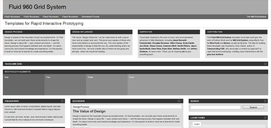 If you’ve been using the ubiquitous 960 Grid System by Nathan Smith (plenty of us have probably used it for projects or experimentation at some point), check out this fluid adaptation of the original project. If you’re comfortable with the original 960.gs, then you already know how to use Fluid 960 Grid System.
5. Gridless
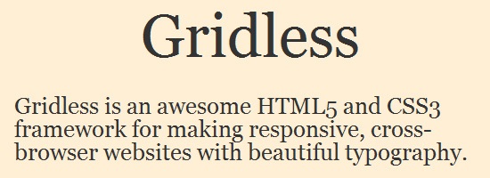 If a grid system for web page layouts seems too restrictive to you, check out Gridless. Gridless is built to be leaner than other grid systems and was constructed with responsive designs in mind. The Gridless code bases its philosophy on the much-discussed mobile first method for crafting websites that must be delivered to a multitude of device environments.
For designers seeking more of a barebones, content-focused approach to responsive web design, you may find yourself quite at home with Gridless.
6. PXtoEM
A tedious mathematical process associated with converting fixed-width design work to a fluid layout is converting absolute units of measurements (i.e. px and pt) into relative units of measurement such as ems and percent (%) for typography, spacing, container widths, etc. PXtoEM is a tool that provides users with a simple conversion tool to help them with all the math.
The site also allows designers the ability to quickly and easily change the base font size of their layout to something that leads to more manageable math. For example, in your HTML document, setting your body element’s font-size to 62.5% gives you the more convenient conversion ratio of 1em is to 10px, making unit conversion a little easier to do.
Testing and Cross-Browser Support
Finally, as we create our responsive web design, we’ll come to the point where our web type is clean and adaptive, our images are flexible and our layout is fluid. Now we need to make sure that our site works in as many browsing environments as possible.
7. Adobe Device Central
The best way to test your website on different devices is to actually test it from within the devices themselves; nothing compares to seeing how your website actually looks and behaves within a particular mobile gadget or computer. However, for those of us who don’t have the budget for hundreds of new gadgets, the solution comes in the form of Adobe Device Central. Device Central is one of the better pieces of software I’ve used for testing a site out on different devices.
If it’s variety and range you seek, Device Central won’t leave you disappointed. With an actively growing device library to choose from, users will find pretty much every major device on the market, ready to load in and test. Testing websites has been made easy as well: Simply input the URI of the web page (local or remote) and then you can freely switch between the devices you want to test it in.
8. Web Developer
While Device Central (above) is cheaper than purchasing a bunch of devices, it still may be outside the price range of some designers’ pocketbooks. A fantastic alternative (or additional tool alongside Device Central) is the Web Developer browser extension. Available for Firefox and Chrome, this extension provides designers with several tools that come in handy when developing responsive or fluid websites.
Most notable is the built-in ability to resize your browser window with the click of a button. New size presets can be saved and used instantly.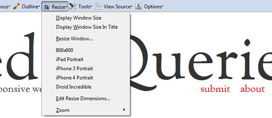 Other helpful features include viewing CSS by media type and outlining your containing elements, which I find useful for quickly identifying break points (or potential break points) in a design.
9. Respond.js
One of the glaring disadvantages of using media queries is that they are part of the CSS3 specifications and therefore is an absent feature in older browsers, such as in IE8 and below. Of course, one might argue that we don’t see a lot of mobile devices running IE6. But one thing to note is that responsive web design isn’t just about mobile devices, it’s a way of developing sites that become optimized for all types of browsing situations. For example, IE7 or IE8 users might still benefit from a site that renders a different layout on large, widescreen monitors versus a small-screen netbook. Fortunately, we have Respond.js, a lightweight, open source script that gives us more options for executing media-query-driven responsive web designs in IE6, 7 and 8. The script is small — only 1KB when served gzipped to site users — and is unobtrusive, so there’s little excuse not to use it!
10. Modernizr
Much like Respond.js, Modernizr is here to bring designers the power of HTML5 and CSS3, even in older browsers. While it’s not as lightweight as Respond.js, it does give you media-query-like abilities in older browsers. The other exciting capability Modernizr brings us, as it relates to responsive web design, is some added support for the very intriguing — but currently problematic and tumultuous — W3C specifications of the Flexbox model that allows for easier and more robust web page layouts.
Modernizr also provides conditional loading features. If you’re concerned about loading many resources because of page speed concerns, Modernizr allows you to conditionally load certain resources based on the user’s browsing circumstances.
Responsibly Responsive
Not every responsive web design project is going to require all of the resources mentioned here. As always, restrict your design projects to only the components that are required to achieve the goals desired. And then, when appropriate, sprinkle in features that can enhance the user experience for as many users as possible without degrading it for anyone else.
These resources were chosen based on their ability to help you complete your responsive web designs more efficiently. Adaptive and responsive web design practices are still in its beginning stages, but they are important because the diversification of browsing devices and viewing methods — like 3D on the Web, for example — is going to continue as our industry progresses into the future. If you know a tool that can help in building responsive web designs, share them in the comments!
Conclusion
Let us know your thoughts in the comment section below.
Check out other publications to gain access to more digital resources if you are just starting out with Flux Resource.
Also contact us today to optimize your business(s)/Brand(s) for Search Engines