Responsive Web Design Tools 2015
Responsive web design is a newer and more advanced method of designing websites. It uses a combination of fluid grids and media queries to adapt the website’s layout to the device it is being viewed on. This means that you can have one website, with different layouts for different devices, resulting in a more streamlined experience for your users.
When creating a responsive web design, you should consider three things: mobile usage, performance, and accessibility. These three aspects are vital to creating a great user experience and ensuring that your website can be accessed by everyone who visits it.
Responsive Web Design Tools 2015

Every designer has a collection of tools that they find indispensable to doing their job. Some of these tools are popular ones that you will likely find in every designer’s toolbox, while others are not so well known. In this article, we will take a look at 9 graphic and web design tools that are set to explode in 2015.
Webydo
A B2B hybrid platform that combines both web design and development in one, Webydo is a great choice for designers looking to create website designs without needing to hand write code or rely on a web developer to help them. One of the most exciting features in Webydo is the ability to create “pixel-perfect responsive web designs” that work great on a variety of devices.
Save
Webydo allows designers to begin with an existing design or layout or to start from scratch with a drag and drop interface. You simply design in the web editor and it writes the code for you. Popular site features, like animated carousels, can also be added without needing to write code, making Webydo is a tool that could quickly become a favorite for many designers.
Invision
If you need a better way to present your ideas and design work to clients, one that goes beyond just static images of interface designs, then Invision may be exactly what you need. This prototyping tool allows you to turn your designs into interactive prototypes. Transitions and animations, along with real-time design and collaboration capabilities and version control and sync capabilities, make Invision a multi-faceted tool that may fit a number of needs for designers.
Save
Ink
Responsive web design has become a best practice and many websites now support a variety of devices with a responsive layout – but what about emails? Ink allows you to easily create “responsive HTML emails that work on any device.” They go on to add that their emails work in “even Outlook”, a sore point for many designers who have to work on HTML emails and who struggle to make them work well in Outlook!
Save
Ink, which was created by the company ZURB, offers a number of templates on their website so that you can begin using the system, and sending responsive HTML emails, quickly.
Infogram
If a picture is worth a thousand words, than a good infographic could be priceless! Infogram is a “data visualization product” that allows you to quickly and easily turn your data into infographics, charts, and even interactive visualizations. There are over 30 interactive chart types available in the system currently; covering a wide range of data visualization needs for websites, presentations, and other instances where a picture will explain much more than text alone.
Save
Infogram offers a free account with a host of features, but paid accounts open up even more functionality. For designers or agencies, there is even a white label option that allows you to add your own logo and brand this solution with your own company’s identity.
Pixlr
While Adobe Photoshop is an industry standard tool that many designers swear by, some of those designers may not want to pay the monthly fee to license that software. For them, Pixlr may be worth a look!
Save
If you’ve used Photoshop before, then the “Pixlr Editor” will be very familiar. Pixlr even opens .PSD files and retains all the original layers, making it a great alternative to Photoshop. Another good use of Pixlr is for clients who have very simple image editing needs (resize, crop, etc.). I recommend this to my clients all the time, allowing them to get all the functionality they need without having to worry about another software license to maintain.
Note: Pixlr and Creative Market are both Autodesk products.
Rinse
One of the most effective ways to get your ideas or message across online is through storytelling. Rinse provides photographers with a unique way to display a portfolio of their work and tell the stories behind that work. Basic accounts allow you to upload one story, while Advanced accounts, which are by invitation only, allow up to 10 stories to be shared.
Save
While Rinse is undoubtedly a great resource for photographers looking to share their work, it is also a wonderful site for fans of stunning photography and can offer inspiration to other designers on how images can be used to tell compelling and powerful stories online.
Material-UI
Material Design is Google’s visual language, including specifications on animation, style (color, icons, images, typography), layout, components, patterns, and more . Material-UI is a “CSS Framework and a Set of React Components that Implement Google’s Material Design.”
Save
The Material-UI website includes example projects for you to look at, as well as instructions on how to begin using this visual language in your own projects.
Frameless
If you need “an easy way to preview prototypes on iOS devices”, then Frameless for iOS 8 is here for you. With a transparent UI and customizable gestures (swipe, tap with three fingers, shake the device, etc.), Frameless is perfect for prototyping and previewing any HTML content in a native context.
Save
Typegenius
This tool is pretty straightforward. In fact, the text on their homepage sums it up pretty succinctly by saying “Find the perfect font combo for your next project.” Select a starter font from the drop down list of available choices and the site will give you some examples of fonts that pair well with that selection. They even include a visual example of the two fonts being used together in a design so you can see how they look side by side.
Save
This is a potentially very helpful tool for combining font choices, and as more fonts are added to their system, this tool will become even more valuable and give designers even more combinations to review and consider!
Skillshare
This website is “a learning community for creators.” Classes are offered in a variety of topics, including many different design disciplines, and those classes include short lessons and hands-on projects to help you learn the materials. You can also share your work with the community on Skillshare, a nice feature for learners who want more than just some video tutorials.
Save
Free Skillshare accounts give you access to a number of classes, but for a small fee (currently $8/month), you will have unlimited access to all the classes they offer. Additionally, in line with their focus on “community”, for every annual membership they sell on the site, they donate a free membership to a student in need.
What Else?
Now it’s time for you to make some predictions. Which graphic and web design tools do you think will take off in 2015? Leave a comment below with your prediction.
Header image created using Program for design and architecture and WildFire Font.
Write for Creative Market
We’re always looking for talented, paid contributors to help out with the blog. If you’re interested, fill out our contributor form.

GETTING STARTED WITH HAND LETTERING?Free lettering worksheets
modern website design
1. Custom illustrations
Illustrations breathe life into your brand and website. When it comes to illustrations, modern web design for 2022 pulls inspiration from print publishing and other traditional art formats.
Gone are the days of cookie-cutter stock images, with websites incorporating custom illustrations into their modern web design in 2022.
Custom illustrations not only make your brand unique, but they also add a level of brand awareness when your custom illustrations speak to your brand’s style.
Example: Take a look at the art of renowned illustrator Alice Lee, for example. She’s designed custom illustrations for popular brands like Macy’s and The Washington Post.
The header of her website shifts with your cursor as you move your mouse across her homepage.
Her art has helped spark a growing trend of custom illustrations for brands that look like they came straight out of a storybook.
And with increased coding capabilities, illustrations continue to evolve beyond 2D design. Even now, digital designs pull in 3D illusions that add another layer of depth to the Internet.
For example:
- The slow change from one color to another with gradient shading
- Digital cut-out styles that mimic designs cut out of layers of paper
- 3D cursor interaction that users can’t help engaging with on your site
You might also enjoy: 10 website statistics to know
2. Full-page headers
Full-page headers are the way to go for modern web design in 2022.
Web designers can implement header variations, but a popular setup involves adding key text or call-to-action (CTA) buttons to the left of the header with eye-catching images on the right. This is because readers tend to focus most of their attention on the top-left of your page.
Example: Discord’s website providing a voice and text chat app for gamers is a good example.
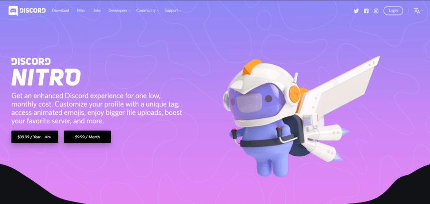
Discord exhibits a fun and quirky image to the right of their header and highlights the benefits of their paid service to the left.
Their CTA buttons are clearly marked and tell viewers exactly what they need to do to get the added experiences.
Scrolling down, you’ll find that Discord groups site elements into cards, making their information sleek, easy-to-find, and easy-to-read, while keeping the fun element.
You can see how websites like this one generate a feeling of playful sophistication.
3. Paralax scrolling
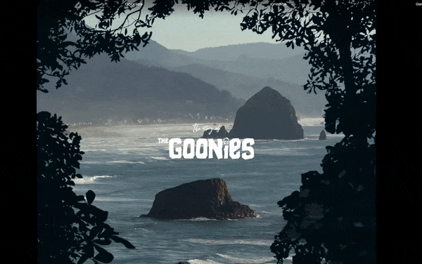
Paralax scrolling is another modern web design trend for 2022. One version of paralax scrolling allows you to expose more of the site each time you scroll — like the site is telling a story.
Example: Take a quick peek at this Goonie’s story site to see how paralax scrolling makes the content fun and interactive.
Background video can also incorporate into dynamic scrolling, where the video only plays when users scroll.
You can also use this technique to trigger animations and make your images appear like magic.
4. White space
Modern website design is heading back to minimalism with the trend of purposeful white space, much like in print magazines.
Like natural currents, white space helps move visitors through your site pages, flowing from one element to the next — and it creates a visual hierarchy where no element distracts from the whole. The breathing room white space provides allows viewers’ eyes to rest.
It also aids comprehension by defining relationships between page elements. When two elements are close together with little white space in between, human eyes will view them as one unit.
On the other hand, if two elements are further apart, your eyes will view them separately.
White space allows visitors to identify your site’s hierarchy.
And they use white space to find the most important information on pages, so knowing how to use white space on your website will help improve your site’s user experience (UX).
Example: Take a look at the white space in Myles Nguyen’s digital portfolio as a web and interaction designer.
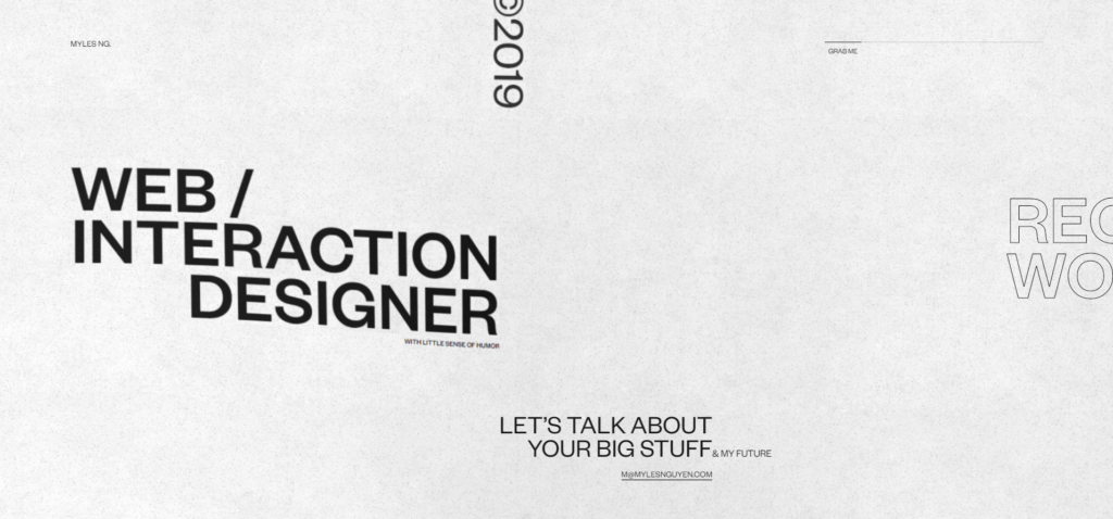
See how it leads you right to all the important bits? The amount of white space he leaves his modern site design lets your eyes travel comfortably, giving you lots of places to rest.
This modern web design example redefines minimalism with thoughtful use of white space.
5. Playful cursors
Modern websites often feature cursors that make viewing pages a new experience.
Implementing playful cursors on your site in 2022 can be as simple as changing the cursor shape or as complex as coding cursor-triggered animations.
Either way, your visitors will have a great time engaging with unique cursors.
Example: Paolo Fornasier has an awesome cursor set up on his online portfolio. The cursor displays different photos with a rippling animation and a piano tone when scrolling over the vertically aligned text of the navigation menu.
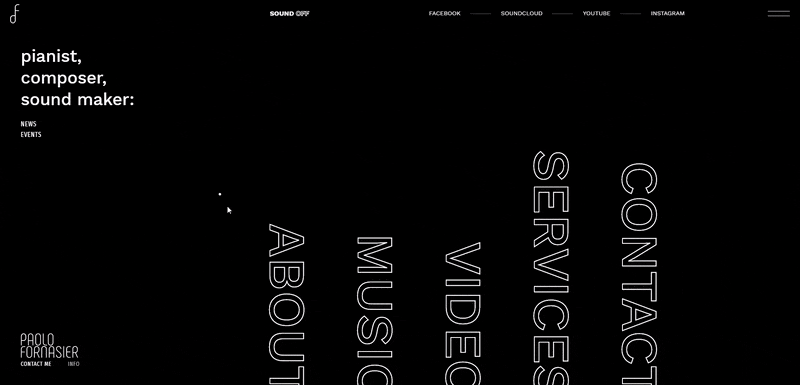
Because of the playfulness of the animation, users easily spend a couple of minutes floating their cursor over the navigation menu.
Your cursor doesn’t have to be as complex as this one, but adding a unique element to your cursor is sure to add some spice to your website.
As a bonus, this example also features another modern web design trend — sound!
6. Increased focus on UX/UI
Modern web design trends focused on humans in 2020, and this will become even more important in 2022. Your site’s UX must be smooth, uninterrupted, and engaging in 2022. This means:
- Fast page load
- Little clutter (use that white space!)
- Scannable, relevant SEO content
- Multimedia
Web designers wrap functionality with creativity to create a great UX, leaning into clean design while still being creative and unique in all the right ways.
The top web designers throw a bit of untidiness into the white, sterile world of technology. Hand in hand with UX, your site’s user interface (UI) must be intuitive in 2022. This means:
- Voice-enabled interfaces
- Image captions
- Video transcriptions
- No distracting elements
- Balanced motion design
Level up your site’s UX/UI by:
- Providing visitors with easy-to-read content and easy-to-use interfaces
- Hitting their aesthetic sweet tooth
It’s also important to note that mobile surfing will get bigger in 2022 vs. 2021. More than 50% of Internet traffic comes from mobile devices, and that number is expected to rise.
For a website to have a successful modern web design in 2022, all of its elements need to translate flawlessly to both desktop and mobile. Mobile responsive animation and videography will become increasingly important for modern web design.
Example: Take a peek at Chobani’s sleek mobile design.
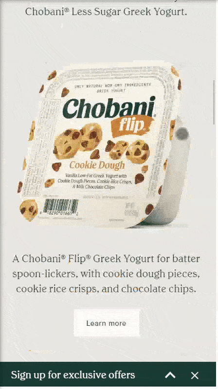
Chobani provides mobile users with a sleek, fully responsive design that makes full use of white space.
Their content is easily scannable with eye-catching, mouth-watering pictures of their products.
With an easy-to-click CTA banner across the bottom of the screen, Chobani sure knows how to pull in their mobile audiences. Who wouldn’t want to sign up for exclusive yogurt offers?!
7. Grid design
Modern web designers will continue to play with grids in 2022 — and an asymmetric layout will likely become even more popular.
Example: Jingqi Fan’s online portfolio displays how functional an asymmetric layout can be. His site exhibits plenty of white space and a minimalist style that highlights his project images, while the asymmetric design keeps his site fresh, exciting, and engaging.
Many top designers use CSS Grid Layout to bring all the capabilities of print layout to the web.
Also known as Grid, CSS Grid Layout is a 2D grid layout system for Cascading Styles Sheet, a coding language that describes the layout of an HTML site page.
Grid allows web designers to create layouts for complex responsive web design more easily and consistently across browsers. Not to mention, it also allows you to effortlessly create a clean, organized aesthetic.
CSS grid layout still has a way to go before it becomes compatible with all interfaces, but it continues to gain momentum as a top web design trend for 2022.
8. Image headers
A lot of modern websites are playing with using an image as their entire header — and it’s proven to be pretty trendy. Not only does a full-image header make a statement, but it engages users immediately.
Example: Check out how Adidas uses a bold image to draw users in. It helps that the image is Beyoncé.
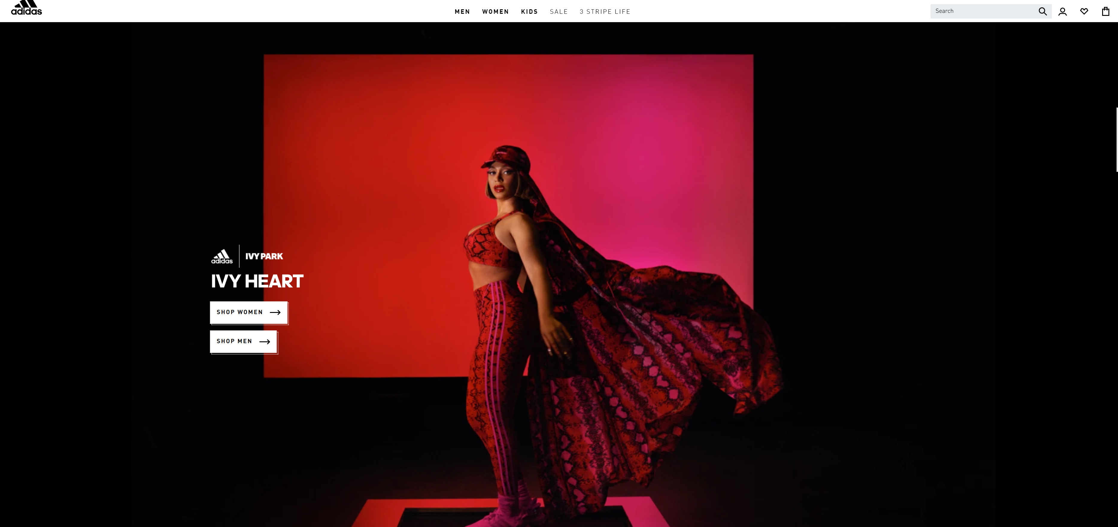
The contrast in this full-images header is strinking, clean, and unique — and features two CTA buttons that guide users to the next step in their site exploration.
9. Impactful, engaging stories
Finally, modern websites in 2022 will shine at telling stories. For users to really connect with your site and your brand, it’s crucial to learn how to tell compelling stories in your content and advertising campaigns. With classy website design and a compelling story, your site is sure to delight and inform your target audience.
Example: Every Last Drop’s website is the pinacle of story-telling websites.
In an effort to raise awareness for water waste, this site tells a story that’s sure to leave a lasting impression on site visitors.
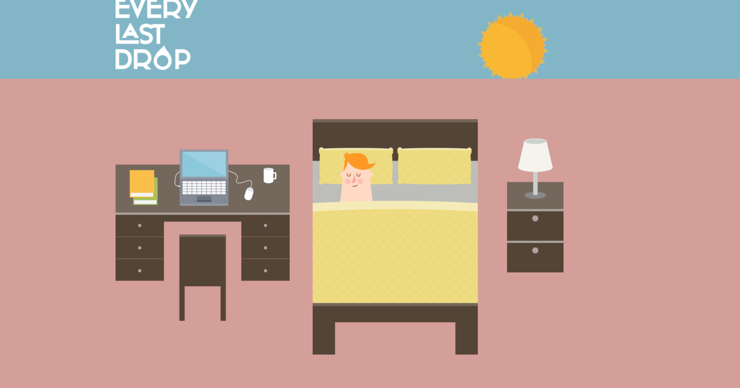
To tell the story, Every Last Drop uses paralax scrolling — another trend that we identified! This might just be the trendiest website around!
10. Color trends in 2022
Modern website design explores color pallets, and every year there’s a new popular color for the web. In 2019, it was blue, and in 2020, mint.
For 2022, trend forecasting company WGSN and Coloro named A.I. Aqua, a tech-inspired shade of blue, their color of the year for 2022.
Overall, Venngage predicts that online color pallets will become more muted in 2022.
Gradients are a trend continuing from 2021 into 2022, and designers will likely continue exploring the depths to which they can take design with gradients. And because gradients cover a range of colors, they’re perfect for targeting a broad audience.
Psychology of color will also play a significant role in web design trends for 2022. Make sure that you research the psychology behind colors before generating a new color palette for your company.
It’s important that your colors match your brand. Some smaller web design trends within colors will likely continue from 2021 into 2022. It seems that:
- Soft, cool colors (blues, teals, and greys) = Information and backgrounds
- Bold, warm colors (reds, oranges, even greens) = Calls to action (CTAs)
Example: Check out Trello’s website for project collaboration and organization software.

This website is a great example of incorporating muted color pallets and gradients into a smooth, illustrative design. They even highlight their CTA in a bright color!
Being smart about color combinations, selecting colors that work together, and staying on-brand are all crucial to benefitting from this web design trend.
Conclusion
Let us know your thoughts in the comment section below.
Check out other publications to gain access to more digital resources if you are just starting out with Flux Resource.
Also contact us today to optimize your business(s)/Brand(s) for Search Engines