If you are a blogger, you know the importance of staying connected with your audience and being in constant communication. You need to stay on top of the latest trends, which means that you need to look for a good WordPress plugin for mobile friendly blogging. There are many different types of plugins available for WordPress blogs that can make life easier for bloggers and their readers.
One important thing to consider when looking at these types of plugins is how easy they are to use. If the plugin is too complicated or confusing, it may not be worth the time or money that you spend on it. As a result, you may end up wasting money and time trying to figure out how to install the plugin yourself. If you have any experience with installing WordPress, this should be no problem at all.
Another important factor is whether or not the plugin will work well with your blog theme. The theme of your website is going to determine how easy it is for people to navigate through your site and find what they need. If you choose a theme that does not allow for easy navigation or has multiple pages, then this could cause your blog to become very slow and unresponsive.
The last factor that you want to keep in mind when choosing a good WordPress plugin for mobile friendly blogging is how
Best WordPress Plugin For Mobile Friendly
1. WPtouch
The WPtouch plugin is definitely one of the most popular choices when WordPress site owners need to quickly turn their websites into mobile interfaces. The key behind the plugin is that it quickly changes any theme you have installed and makes it more usable for people with mobile devices. One thing that’s interesting about WPtouch is that it factors in the Google Mobile Test and makes sure that your site passes that test. This way, you’re able to maintain your SEO rankings and potentially improve them in the future.
With the free version of WPtouch, your desktop website design stays intact, but the mobile version is changed to a fast, stylish, and user-friendly version made only for smaller devices like phones and tablets. In addition, you’re able to complete this process without being a coder.
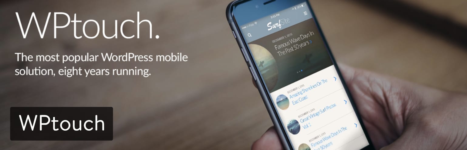
A Premium Version of the WPtouch plugin is available for those who would like to improve their features with better mobile themes and certain extensions for incorporating advertisements into your mobile site. In addition to that, the Premium Version includes caching options, web font controls, and direct support from the WPtouch developers. You can purchase the WPtouch Pro plugin from its website. The cheapest plan starts at $79 per year and works on one WordPress site.
If you’d like to put the plugin on more sites, or get developer or multisite support, you choose from one of the more expensive plans. All in all, the pricing looks rather reasonable if you’re interested in better-looking mobile themes and some features for ads, related posts, and more.
What Makes This a Top WordPress Mobile Plugin?
- WPtouch has a free plugin that almost instantly converts your current website theme into a mobile one.
- The Pro Version isn’t that expensive, and it provides a wide range of beautiful themes and cool extensions for things like ads and advanced typography.
- The Settings page for WPtouch is consolidated nicely in the WordPress dashboard and it’s easy to understand for all website owners.
- The plugin does a good job of replacing responsive themes that make heavy use of image files, JavaScript, and CSS. The mobile theme provided is fast, lightweight, and perfect for those who aren’t satisfied with their current mobile theme.
- You’re able to slightly customize your mobile browser viewing experience. For instance, the plugin lets you choose which browsers you want to support, while also giving you tools for changing around your mobile menu.
- The customer support in the Premium Version is offered through an email address and a comprehensive collection of how-to’s and best practices articles.
2. AMP for WP
The AMP for WP plugin provides a mobile website for your current site. The AMP stands for accelerated mobile page, referring to its speed and efficiency. It’s an impressive package that requires you to put in minimal effort to replace your current non-responsive theme. Also, if you have a responsive theme, it’s a good idea to test to see how fast it’s loading. If it’s not up to your standards, simply replace it with the AMP for WP plugin. The actual core AMP for WP plugin is completely free. You receive all of the features in a quick download from the WordPress plugin library. However, some elements on a mobile phone don’t quite show up as well when compared to a desktop.
Therefore, AMP for WP sells certain extensions individually or in packages. You can also buy different mobile themes that are typically more functional and beautiful than the default ones. What’s great about this setup is that most extensions and themes sell for less than $10. One of the extensions is for posting ads on your mobile theme, while others allow your theme to work better with contact forms, WooCommerce, caching plugins, and more.

There’s also the option to go with a membership and gain access to all of the themes and extensions. For instance, if you only need the extensions and themes for a personal site, it’ll cost you $149 per year. Several other plans are available, but it tops out at $499 per year for agencies that need the extensions on an unlimited number of sites.
But just remember, the entire AMP for WP plugin is free. So, you shouldn’t upgrade unless there’s a specific extension that you absolutely need or if you’re trying to improve your theme. I’d argue that the majority of features are already packed into the core plugin, with tools for Facebook comments support, landing pages, email optin subscriptions, and more.
Check out our in-depth tutorial on how to configure and set up AMP for WP.
What Makes This a Top WordPress Mobile Plugin?
- The plugin is entirely free with most of the best features already included.
- There are plenty of other extensions you can get for less than $10. For instance, if you wanted your Easy Digital Downloads store to look good on the mobile theme, you could buy a plugin for that.
- The membership pricing is pretty reasonable, and it allows you access to all of the extensions and themes in the AMP for WP library.
- The mobile site that AMP for WP creates for you is most likely going to be much faster and cleaner than the responsive site that came with your WordPress theme.
- AMP for WP does a wonderful job of supporting elements on your website that are coded with JavaScript or CSS (which sometimes have trouble on mobile devices). For instance, the plugin supports star ratings and comments. You can also embed videos from various sources.
- Note: AMP isn’t for everyone and we ended up disabling it on our website after we saw a decrease in conversions. Always test for yourself.
3. Jetpack by WordPress.com
Jetpack, as you may know, is from Automattic and provides a collection of tools so that you don’t have to keep installing dozens of plugins. You receive everything from security tools to social options, and design services to marketing modules. Considering this is an article about WordPress mobile plugins, it would definitely make sense to focus on the mobile capabilities. Well, Jetpack also provides a mobile theme that can be implemented for your website by going into your Jetpack settings area.
The theme only operates when it detects a mobile device, and it can override your current responsive theme if you’d like to do that. The thing we like most about the Jetpack mobile theme is that it has a decent number of settings for adjusting how the website looks on these smaller devices. For example, you might want to change around how your menu looks, or display huge featured images if you think they look too cluttered on a mobile phone.

This is a free feature from Jetpack, so it might be worth your while if you’re planning on using some of the other Jetpack features that come along with it. We also enjoy the simplicity of the Jetpack mobile theme. It almost looks like it has the basic WordPress branding, but you can change around the colors to match your own business. But overall, this is one of the most reliable mobile interfaces you can find. It’s clean, fast, and ready to make your website look good for both users and search engines.
What Makes This a Top WordPress Mobile Plugin?
- Although many of the features in Jetpack need to be paid for, the mobile theme is free and ready to implement with the click of a button.
- The theme is basic, but it’s modern and almost guaranteed to look great on all browsers and devices. This is a plus if you’d like to ensure that Google gives you a thumbs up for your mobile experience.
- The Jetpack plugin also includes lazy loading for images on the mobile theme. So, when a user scrolls down on your mobile website, the images won’t load until they actually reach them. This way, your site is running at a more efficient speed and doesn’t waste any resources until it needs to.
- The mobile theme automatically places your sidebars below the main content so that they are still on the page but not cluttering up the one-column format that works so well on mobile devices.
- Custom headers and backgrounds are supported, so you have a few settings for changing these around and making sure your primary images look great for your users.
- By default, the Jetpack mobile theme grabs your primary menu and displays that for mobile users. However, there is a way to adjust this and have a completely different menu show up for those people.
- Quite a few other settings are involved for things like hiding featured images, showing a promotion, or changing around your excerpts for blog posts.
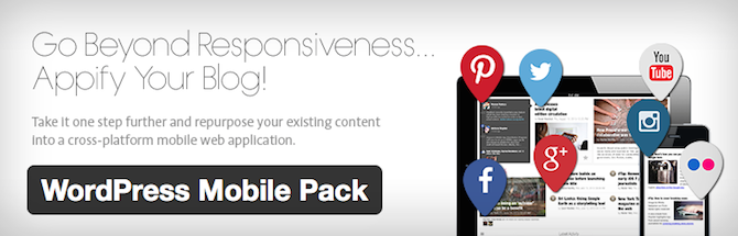
4. WordPress Mobile Pack
The WordPress Mobile Pack offers what it calls progressive web apps. These are fast, reliable apps with some interesting features such as push notifications and smooth animations for the mobile interface. It’s important to not be confused by how the developers use the term “app.” These aren’t apps like the ones you would download from an app store to your phone. These are standard mobile websites that get loaded onto the user’s browser. The reason they call them apps is because you get to choose from several templates that mimic the user interface of an actual iPhone or Android app.
So, remember that if you want a real app for your WordPress site, you’ll have to look elsewhere. However, the themes are beautiful and this type of “app” design is sure to make your mobile site stand out compared to some of the standard responsive themes we’ve seen on the market.
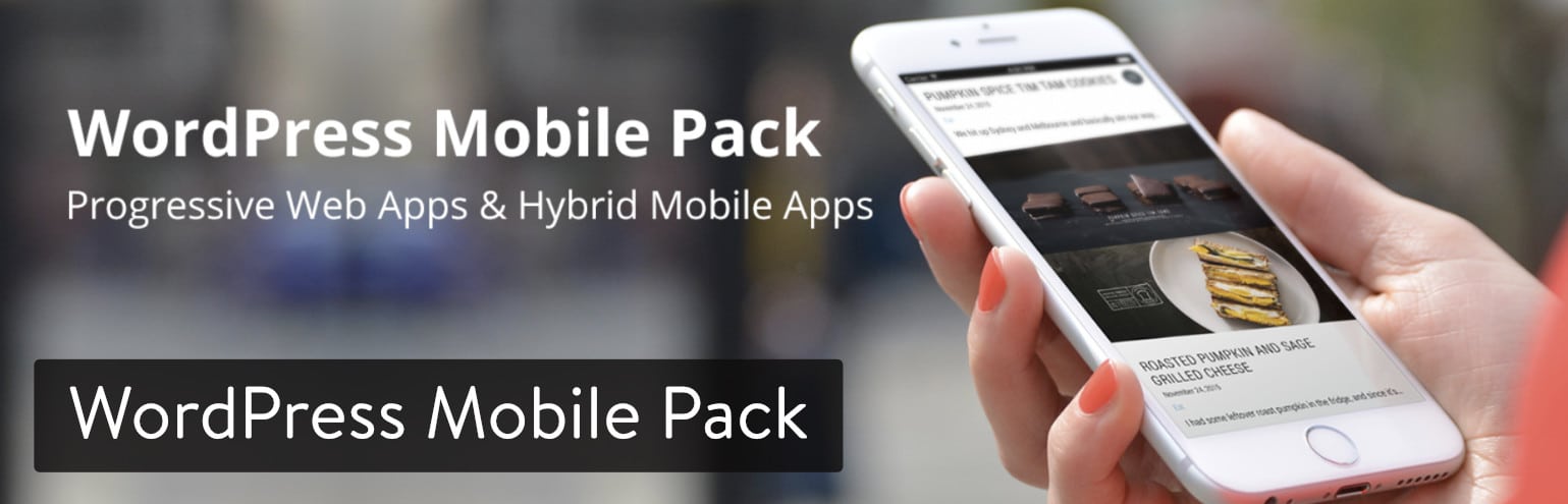
The free version of the WordPress Mobile Pack has a wide range of features and a simple process for setting up your mobile website. It tries to mimic an app the best it can, by prompting users to save the mobile website to their homescreen for later use. You also get a default theme that includes six different cover pages that rotate for a fresh feel at all times. You’re able to adjust items like your logo, fonts, and colors, all from the convenience of your WordPress dashboard. As we mentioned before, the WordPress Mobile Pack plugin does have a free version. But if you’d like to get more customization options and a large collection of app themes, the Pro version starts at $99 per year.
What Makes This a Top WordPress Mobile Plugin?
- The primary features are free with the core plugin.
- You’re able to upgrade for additional features, monetization options, unlimited push notifications, and more with the affordable Pro version.
- Although you’re receiving a mobile website, and not a real app, these templates look and work very similar to regular apps you have on your phone. For instance, all of the themes look more like an app than a mobile website. Also, you can send out push notifications and ask users to save a link to the page on their phones.
- You have options for deciding on which pages and posts will show up on the mobile website. For example, you might decide that it’s not necessary to show the Contact Us page on a mobile interface because you’re already showing a telephone number in the header.
- Readers have the ability to add your mobile website to their phone’s homescreen. This, once again, mimics the way an actual app works on the user’s phone.
- Google Analytics integrates with your mobile website, so you can distinguish between who and how many people are visiting your mobile site as opposed to your regular site.
5. WP Mobile Menu
The WP Mobile Menu plugin is a great solution for those who would like to put more focus on the mobile menu part of your website. It’s quite common to see beautiful responsive websites that have terrible menus. Unfortunately, the menu is usually how someone moves around your website, unless they’re clicking on call to action buttons or links. The mobile menu should have a smooth slide-in effect, with large icons, menu text, and buttons.
So, the main reason you would consider this WordPress mobile plugin is if you already have a responsive website that you enjoy, yet you think there’s something to be desired in the menu. Therefore, you would install this plugin and gain full control of that mobile menu without damaging what’s being shown from your previously created mobile site (potentially from your WordPress theme).

These mobile menus are beautiful. They offer controls for Google Fonts, background images, naked headers, and more. You can configure the menu to show three depth levels or stick to the regular menu configuration you have for your website. The standard WP Mobile Menu plugin can be downloaded for free. It doesn’t matter how many websites you implement the mobile menu on.Struggling with downtime and WordPress problems? Kinsta is the hosting solution designed to save you time! Check out our features
Some organizations would prefer the Professional version, which starts at $6.99 per month and allows for features like a header search, menu item icons, and 2000+ icons. There’s even a WooCommerce plan for $9.99 per month. This has all of the Professional plan features, along with a menu cart icon, sliding cart, and more. Finally, the Enterprise version is $39.99 and offers a private Slack channel, personal success manager, and special rates for custom development.
What Makes This a Top WordPress Mobile Plugin?
- It’s a great solution for those who already enjoy their mobile website design but would like to improve on the mobile menu.
- The core plugin is free, but you have other options like a Professional version, or an eCommerce version for adding items like shopping carts on the mobile interface.
- Google Fonts, and thousands of icons, are integrated into some of the plans, meaning you’ll be able to create a more visual mobile menu.
- You can decide on a naked header (which is somewhat transparent) or a menu with an image background. Both of these are excellent ways to stand out with your mobile design, considering you don’t see either that often.
- The free version includes options for three depth levels on your menu. You can go all of the ways up to five depth levels if you sign up for the Professional plan.
- Menu branding (with a logo) is possible in the Free plan.
- Users can hide certain elements from the mobile menu, instead of being forced to use everything from your regular website menu.
wordpress mobile optimization
Tip #1: Use Mobile-Friendly Themes
In order to keep the theme of your website consistent between desktop and mobile versions, a mobile theme is perfect for you. This way you don’t have to develop one yourself or have to hire someone to do it for you. Along with the increase in mobile device use also comes an increase in the number of mobile themes available. Funny how that works out, huh?
Here’s a few to check out:
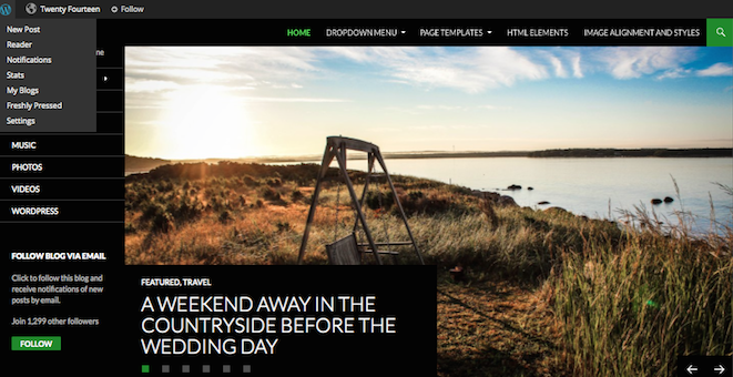
- Twenty Fourteen. WordPress’ default theme is actually ideal for many websites. It’s responsive, attractive, and offers numerous menu configurations to fit on any-sized screen.
- Total theme. This top selling theme is a great way to display your website across a variety of mobile devices. Total is fluid responsive, so your page layouts automatically adjust to the browser window. Plus added custom mobile options make it easy to optimize.
- Pineapple. This minimalist WordPress theme is amazing as a theme, which makes use of a mobile responsive design.
- Mayashop. If you’re operating an e-commerce site, the Jigoshop plugin is a great option that works seamlessly with the Mayashop theme. E-commerce sites tend to be a little more challenging to optimize for mobile devices. This theme will help to suit your specific design.
Tip #2: Use Plugins
One of the best things about WordPress is the availability of plugins that make the website owner’s job much easier and more streamlined. Plugins serve a ton of purposes, including helping to make a site mobile friendly.
As a site owner, you’d rather spend your time and effort concentrating on the actual content on your site than all the technical mumbo-jumbo that goes on behind the scenes to make your site function, right? A simple plugin can help to make the content on your site easy to read without having to zoom in a million times or scroll from left to right when trying to read through a paragraph on a phone.
Here are a couple of plugins you might want to check out:
WordPress Mobile Pack. This plugin gives you total control over your website’s mobile version. Domain mapping makes it easy to identify the most popular devices, with a single theme offered in four different color palettes.
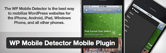
WP Mobile Detector. This plugin provides a simple way to optimize your site for mobile devices in no time at all. WP Mobile Detector works with thousands of different smartphones, tablets, web-enabled phones, and so forth, giving your visitor a pleasant experience without you having to spend weeks trying to figure it all out yourself.
Tip #3: Make Your Site Responsive
You’ve most likely visited a responsive website in the past. These types of sites respond appropriately according to the device it’s being viewed on. When being viewed on a desktop, the site is presented one way. When being viewed on a smartphone, it’s presented in another. The same thing happens when viewing the site on a tablet or laptop, or any other mobile device you can get your hands on.
Having a responsive design to your site simply means that it will be customized automatically, no matter what source your viewer is visiting from. Pretty cool, right? Having a responsive website is easy as pie if you’re using WordPress as your site’s platform. All you have to do is find a responsive WordPress theme to suit your website’s style (we can’t stop talking about our fully responsive Total WordPress theme with built-in drag & drop page builder, so you can create any responsive layout you want!).
Tip #4: Minimize Elaborate Graphics
Think about the size of a mobile device’s screen. Granted, they seem to be getting bigger every day, but they’re certainly smaller than the average desktop. Forget filling your website with fancy graphics – too many of them will just cause load times to increase, which is a no-no for mobile surfers.
This is particularly true for e-commerce sites. Shoppers don’t want to be bombarded with graphics to have to sift through. They want to be able to make a purchase quickly and efficiently. So veto the excess graphics and keep it simple.
Tip #5: Choose Text Wisely
In addition to minimizing graphics on your website, you’ll want to minimize text too. Visitors have very limited space on their screens to check out what you’re selling or writing about. Since they’re not likely to zoom in and out or scroll up and down, keep your text razor-focused on what your product is all about.
Forget about all the ‘frills’ that many sellers try to use to garner more attention to their products. Give shoppers only what they need to make an informed purchase.
Conclusion
Let us know your thoughts in the comment section below.
Check out other publications to gain access to more digital resources if you are just starting out with Flux Resource.
Also contact us today to optimize your business(s)/Brand(s) for Search Engines