We are an experienced team of bloggers. We write about different topics related to WordPress, from how to make your website secure, to how to make it more attractive to search engines and users.
In this article you will learn about the best WordPress plugins for mobile optimization.
Table of Contents
Best WordPress Plugin For Mobile Optimization
1. WPTouch

The WPTouch mobile plugin for WordPress allows users to create a fully mobile responsive website. It’s the most popular WordPress mobile plugin available.
WPTouch is straight forward – when a user accesses your website via a mobile device they’ll see mobile optimized version.
It’s incredibly user-friendly too. There are tons of fully customizable options, so you can make it fit the look and feel of your website.
There’s both a free version and a pro version, and you can pay for extra themes and advertising on your mobile website.
2. Smush

Smush is specifically for image optimization in WordPress. This plugin compresses images to better optimize them on your webpages shown on a mobile device.
There are additional features like image resizing, auto-optimize, bulk smush to optimize up to 50 images at once, and lazy loading.
3. AMP

AMP is a unique mobile optimization tool. It simply streamlines the way your content is viewed on the frontend without adapting a mobile theme. In the backend, all posts are checked before they are loaded on a webpage.
In addition, the plugin offers features like a static layout system, lazy loading, resource prioritization, pre-rendering and more.
4. EWWW Image Optimizer

WordPress already has the ability to optimize versions of your images. However, with EWWW Image Optimizer, you can optimize new images and change the compression options of previously uploaded images.
Additional features include lossless compression of images that have JPG or PNG formats.
5. Mobile Smart
Mobile Smart has the ability to detect the device the website is being viewed on and show the optimized version for that device. This plugin also adds template tags and can detect different mobile tiers including touch, smartphone, and tablet.
This means that different content can be included on each webpage depending on which device a potential customer is using to view it. The plugin also includes image transcoding, or rescales images to fit on each device.
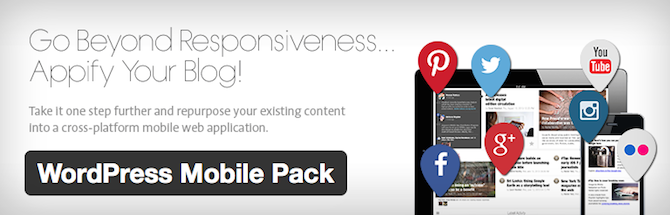
6. WordPress Mobile Pack

The WordPress Mobile Pack actually takes things a step further and repurposes existing content to show on mobile web applications. This plugin is an ideal choice for bloggers and content curators to publish content easily.
This plugin provides the same look and feel on a mobile device as its desktop counterpart. No matter what device is used, or if it’s in landscape or portrait mode, the plugin can provide the content in the most optimal format.
There are also six different theme options provided with the plugin, and each theme can be fully customized by color, typography, and page elements.
7. Lazy Loader
The Lazy Loader plugin allow images to be loaded only when they will be viewed. Basically, when a user scrolls down a page, the image will fully load so that they can see it.
This way, the website is not overloaded by trying to load all of the images and content at once. Instead it saves time by only loading the elements that are being viewed.
wordpress mobile optimization
Tip #1: Use Mobile-Friendly Themes
In order to keep the theme of your website consistent between desktop and mobile versions, a mobile theme is perfect for you. This way you don’t have to develop one yourself or have to hire someone to do it for you. Along with the increase in mobile device use also comes an increase in the number of mobile themes available. Funny how that works out, huh?
Here’s a few to check out:
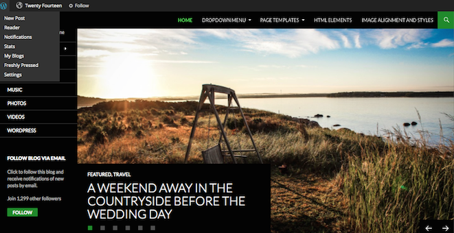
- Twenty Fourteen. WordPress’ default theme is actually ideal for many websites. It’s responsive, attractive, and offers numerous menu configurations to fit on any-sized screen.
- Total theme. This top selling theme is a great way to display your website across a variety of mobile devices. Total is fluid responsive, so your page layouts automatically adjust to the browser window. Plus added custom mobile options make it easy to optimize.
- Pineapple. This minimalist WordPress theme is amazing as a theme, which makes use of a mobile responsive design.
- Mayashop. If you’re operating an e-commerce site, the Jigoshop plugin is a great option that works seamlessly with the Mayashop theme. E-commerce sites tend to be a little more challenging to optimize for mobile devices. This theme will help to suit your specific design.
Tip #2: Use Plugins
One of the best things about WordPress is the availability of plugins that make the website owner’s job much easier and more streamlined. Plugins serve a ton of purposes, including helping to make a site mobile friendly.
As a site owner, you’d rather spend your time and effort concentrating on the actual content on your site than all the technical mumbo-jumbo that goes on behind the scenes to make your site function, right? A simple plugin can help to make the content on your site easy to read without having to zoom in a million times or scroll from left to right when trying to read through a paragraph on a phone.
Here are a couple of plugins you might want to check out:
WordPress Mobile Pack. This plugin gives you total control over your website’s mobile version. Domain mapping makes it easy to identify the most popular devices, with a single theme offered in four different color palettes.
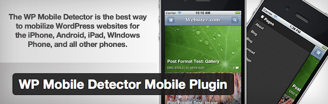
WP Mobile Detector. This plugin provides a simple way to optimize your site for mobile devices in no time at all. WP Mobile Detector works with thousands of different smartphones, tablets, web-enabled phones, and so forth, giving your visitor a pleasant experience without you having to spend weeks trying to figure it all out yourself.
Tip #3: Make Your Site Responsive
You’ve most likely visited a responsive website in the past. These types of sites respond appropriately according to the device it’s being viewed on. When being viewed on a desktop, the site is presented one way. When being viewed on a smartphone, it’s presented in another. The same thing happens when viewing the site on a tablet or laptop, or any other mobile device you can get your hands on.
Having a responsive design to your site simply means that it will be customized automatically, no matter what source your viewer is visiting from. Pretty cool, right? Having a responsive website is easy as pie if you’re using WordPress as your site’s platform. All you have to do is find a responsive WordPress theme to suit your website’s style (we can’t stop talking about our fully responsive Total WordPress theme with built-in drag & drop page builder, so you can create any responsive layout you want!).
Tip #4: Minimize Elaborate Graphics
Think about the size of a mobile device’s screen. Granted, they seem to be getting bigger every day, but they’re certainly smaller than the average desktop. Forget filling your website with fancy graphics – too many of them will just cause load times to increase, which is a no-no for mobile surfers.
This is particularly true for e-commerce sites. Shoppers don’t want to be bombarded with graphics to have to sift through. They want to be able to make a purchase quickly and efficiently. So veto the excess graphics and keep it simple.
Tip #5: Choose Text Wisely
In addition to minimizing graphics on your website, you’ll want to minimize text too. Visitors have very limited space on their screens to check out what you’re selling or writing about. Since they’re not likely to zoom in and out or scroll up and down, keep your text razor-focused on what your product is all about.
Forget about all the ‘frills’ that many sellers try to use to garner more attention to their products. Give shoppers only what they need to make an informed purchase.
Conclusion
Let us know your thoughts in the comment section below.
Check out other publications to gain access to more digital resources if you are just starting out with Flux Resource.
Also contact us today to optimize your business(s)/Brand(s) for Search Engines