Responsive web design is the future of website design. It allows a website to automatically adjust its layout to fit the screen size of any device, from desktop computers to smartphones. The term “responsive” refers to a website’s ability to respond to the size of its user’s screen.
With this technology, you can create one website that works on all devices—no matter what size or shape it might be. A responsive website looks great on mobile devices like phones and tablets, but it also scales up beautifully for larger screens like laptops and desktops. This means that your customers can access your site wherever they are—whether they’re using their phone or their laptop—and it will always look great and function perfectly.
Responsive web design makes it possible for businesses of every size to create an attractive, user-friendly online presence without having to invest in separate websites for each type of device or platform (desktop computers, laptops, smartphones).
Responsive Web Design Software
As the name suggests, the website is designed to respond to the size of the screen each time it loads by changing the way the display appears to match the screen layout and provide an intuitive experience for every visitor. Responsive web design has become the go-to option for web designers who care about providing a good and consistent experience on all types of devices.
Web designers do also have the option of building two separate websites: a mobile one that loads on smaller devices, and a desktop one that loads on computers. But with the growing number of device types and screen sizes of smartphones and tablets, that option poses the risk of still only working well in a fraction of cases.
And if you’re providing different content or information to different visitors, you risk providing an inferior experience to some of your visitors. Why keep content you know is valuable for your desktop visitors inaccessible to your mobile ones?
Responsive web design is good for your visitors, good for search engine optimization (SEO), and easier on you, since you only have to build and maintain one website. But if you’re new to web design, figuring out how to create a responsive website can seem overwhelming. Luckily, there are a number of tools to help with an adaptive design that make things easier.
20 Tools for Responsive Web Design
The tools available for responsive web design fall into three main categories.
- For beginners wanting a simple option for building a responsive layout on their website, you have tools that will help you find and use responsive templates.
- For more experienced designers, there are a number of tools that aid in the responsive design process.
- Finally, for anyone that’s built a responsive website, there are responsive testing tools to help you make sure your finished website works well on all device types.
Tools For Responsive Web Design Templates
If you’re building a website and don’t know the first thing about web design or coding, but you know it’s important to have a responsive website, then you may be worrying about where to even start.
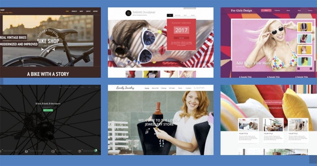
Fortunately, as the importance of responsive web design has become increasingly clear over the years, a number of designers and web building tools have seen the need to develop responsive web design examples that newbie website owners can use to easily build a responsive website.
Here are a few tools you can use to find responsive templates that will make creating a responsive website simple, even for those with limited web design skills.
1. Gator Website Builder
Gator Website Builder has over 100 responsive website templates to choose from for an adaptive design. Anyone that subscribes to a Gator plan has access to the library of templates, as well as a intuitive website builder that makes it easy to customize the template you choose to create a unique, fully responsive website.
2. Simbla
Simbla offers 100 simple responsive website templates customers can choose from to jumpstart the web design process. For anyone just looking to build a basic website with a few pages, their templates are straightforward and responsive.
3. Colorlib
Colorlib is a resource that collects and highlights themes—both free and premium—that anyone building a website on WordPress can use. Some of the site’s blog posts specifically collect responsive themes and templates. While working with their themes will require a little more skill than using a website builder, they can provide a good starting point for building your website and can save you some money if you’re willing to commit the time to learning basic design skills.
4. ThemeForest
ThemeForest, part of Envato, offers nearly 45,000 themes and templates for people building a website with WordPress, including over 5,000 that are responsive. Their themes start at around $5, but can cost over $100 for some options. Many of the themes include reviews and ratings from past customers, so you can get some advance insights into how well they work.
5. Templated
Templated supplies nearly 900 responsive HTML templates that are freely available under the Creative Commons. Anyone can browse their collection and download and use any template that feels like a good fit for your needs. If you’re looking for a free option to get started with, this is a good place to look first.
Tools For Doing Responsive Web Design
Responsive templates are the best option for anyone with limited skills hoping to get a website up on their own. For designers with the skills to build a website from scratch, there are a number of tools for responsive web design that make doing the job well easier.
6. Bootstrap
Bootstrap is a free, open source tool for building mobile-first responsive websites. Bootstrap provides a toolkit of the various elements you need to build a responsive website and lets you pick and choose the elements you want to include on your page to make prototyping intuitive.
7. Wirefy
Wirefy is a free tool for easily creating responsive wireframes. The tool makes it easy to plan your design around your content and make sure it looks good across device types. It requires a working knowledge of HTML and CSS, but makes the work of building a responsive site easier.
8. FitVids
If your website includes video, FitVids is a free, useful tool for ensuring your videos load at the right width on different devices. It’s a simple plugin that allows for fluid video embeds. Whatever screen size your visitors use, the videos will automatically load to the right width.
9. Adaptive Images
What Fitvids does for videos, Adaptive Images does for images. The program detects a visitor’s screen size and automatically delivers the images on your page in the right size for them to look good on the screen and load quickly.
10. FitText
FitText does for fonts what FitVids and Adaptive Images do for visual elements. It automatically resizes your headings and display text based on the size of the screen visitors have. FitText is a free and easy-to-use plugin.
11. Webflow
Webflow is a tool to help people design and build responsive websites visually—it automatically generates the code for you, so you can stick to the visual side of design. The company offers a free basic plan you can use for designing a responsive site, and paid plans that come with additional features and services.
12. Invision
Invision is a tool for enabling collaborative responsive design. It makes it easy to share your work with others on a team. And notably, it makes it easy to access it on various devices as you work, so you can test out how it looks on different screens as you go. Invision is free for one active prototype at a time, and has paid plans for those who need more.
13. Blueberry
If you want to include an image slideshow on your website, the Blueberry image slider is designed to be automatically responsive. It’s a free open-source tool that automatically sizes all the images in your slideshow to fit on the screen of the device your visitors are on. All you have to do is load your images.
14. UXPin
UXPin is a platform for web design and prototyping that prioritizes user experience. The platform enables quick and easy design and provides a library of pre-built components you can incorporate into your designs. It also makes collaboration with other designers on your team easy. UXPin is a subscription product that starts at $23 a month.
15. Style Tiles
For professional designers that work with clients, Style Tiles is a useful tool for creating quick mock-ups of your design ideas for approval, before having to dive into serious design work. You can download free templates created by a designer familiar with the process of working with clients and knowledgeable about the importance of responsive web design.
Responsive Testing Tools
One of the challenges inherent in responsive design is that, while your goal is to create a website that looks good on every possible device and in every different browser, you can’t reasonably test out every variation on your own. There are dozens of different screen and resolution sizes out there, and no person or business will have access to every one of them.
While it’s worth it to try out your new responsive website on as many devices as you can access, you can go further by using responsive testing tools to see how your website works on additional screen sizes.
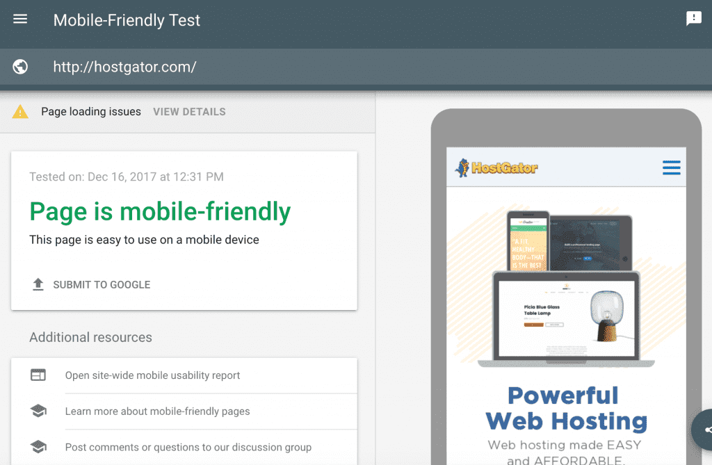
16. Google’s Mobile-Friendly Test
Google’s Mobile-Friendly Test isn’t specifically for testing responsive websites, but Google has been upfront for some time about how important its algorithm considers mobile friendliness in websites in determining rankings. For any business that cares about SEO, Google’s tool lets you go straight to the source to confirm that your website is mobile friendly enough to meet the search engine’s standards.
17. Responsinator
Responsinator is a free and handy responsive testing tool where you all you have to do is enter your URL, and you can see how your website looks on a few different device sizes and orientations. It’s a quick way to get a snapshot of how other visitors will see your website.
18. Browserstack
While Responsinator lets you test your website on a few different device sizes at once, for businesses that want to really be confident that a responsive website works on every possible device, a more comprehensive solution is called for. Browserstack is a subscription product that automates the process of testing your website over 2,000 device and browser types.
19. Resizer
Resizer is a free tool that provides a quick snapshot of how your website looks on the three main screen sizes, but also lets you test out how it looks at different widths on each device type. With a simple click, you can see how people with a variety screen or browser sizes will see the website, so you can get a much broader view of the different ways your responsive site will appear to visitors.
20. CrossBrowserTesting
While a lot of how we talk about responsive design focuses on different device types and sizes, the way your website shows up in different browsers is another important consideration for user experience. The CrossBrowserTesting tool automates the process of testing out how your website looks and works in all the main browsers so you can spot potential issues before they affect how your visitors experience the website.
web designing tools for beginners
There are so many great web design tools around these days, created to help you with mockups, frameworks, testing, and more. You’ll also find an abundance of downloads on the many elements that make up good web design, including but not limited to VR, animation, colours, and typography.
No matter what problem you’re trying to solve in your web design workflow it’s likely that someone has made a tool for it, whether it’s a standalone utility or a feature within a larger app. The even better news is that so many of these great tools are free, although this does make the array of tools on offer far more daunting to choose from.
To help web creatives out, we’ve rounded up what we think are the best tools around right now (for a more specific list, see this UI design tools roundup). As this is quite a long list, we have arranged the tools into sections to make the article easier to navigate. On this page, you’ll find complete web design software such as Sketch and Adobe XD, followed by more basic dedicated wireframing tools, and web design frameworks and libraries. On page two, there’s a range of smaller, more specialised tools for everything from working with images to ensuring inclusivity in your work.
Sponsored Links
Play Now In Your Browser
Hero Wars
While you’re here, you might want to check out our roundup of the best web hosting services, and choose one of the best website builders, too.
RECOMMENDED VIDEOS FOR YOU…
CLOSE
COMPLETE DESIGN TOOLS
- InVision Studio
InVision aims to be the only UI tool you’ll ever need
InVision aims to be the only UI tool you’ll ever need (Image credit: InVision)
InVision Studio aims to cover all bases and be the only UI tool you’ll need. It comes with a bucketload of features to help you create beautiful interactive interfaces, including tools for rapid prototyping, responsive and collaborative design, and working with design systems.
If you’re already using InVision with tools like Sketch, there’s quite a bit of crossover in features. However, Studio’s power lies in the prototyping department, especially if your design involves animation. Rapid prototyping will allow you to create complex and imaginative transitions, enabling you to really achieve the level of animation you desire. Simply figure out how you want to your UI to look at the start of its transition, and then design the end result. InVision Studio works the rest out for you.
On top of that, you can create these custom animations and transitions from a number of gestures and interactions like swiping, clicking, and hovering.
When you’re all done, export your prototypes through InVision and invite people to collaborate. You can view your project on its intended platform – a great way to explore and test your design. Clients will then be able to comment right onto the design.
To top that, you can stop thinking about creating numerous artboards for multiple devices – Studio’s layout engine will adjust your design to any screen automatically. This timesaver gives you space to think so much more about your design.
- Sketch
Sketch has replaced Photoshop as the UI design tool of choice for many web designers [Image: Bohemian Coding]
Sketch has replaced Photoshop as the UI design tool of choice for many web designers [Image: Bohemian Coding] (Image credit: Bohemian Coding)
Bohemian Coding’s Sketch is one of the most widely-used web design platforms; it’s a highly powerful vector-based tool for building interfaces and prototypes in a collaborative way. Sketch was built especially for making websites and apps so there are no unnecessary features cluttering your interface and it’s faster and more efficient than software that has a broader scope.
Rory Berry, creative director at Superrb, made the switch to Sketch a few years ago, and highly recommends it. “Compared to Photoshop, sorting all your documents and making revisions on Sketch is much easier,” he begins. “Sketch has small documents whereas Photoshop has large ones. Due to it being a vector-based app, the file sizes are dramatically smaller compared to Photoshop.”
And that’s not all. “The built-in grid system in Sketch is great and makes interface design much easier. I think the overall UI and minimal feel makes it much cleaner to design in and user friendly. Photoshop seems very complicated in comparison.”
The community offers hundreds of Sketch plugins to make your design workflow easier and smoother.
The downside of Sketch is that it’s only available on Mac, and there are no plans to support other operating systems. This has been a problem, as designers will often want to share .sketch files with developers using Windows. Fortunately there is now a “Sketch for Windows” application called Lunacy that will open and edit .sketch files and eliminate most of this pain – read about it in the Exporting and Converting section of this article.
Advertisement
Don’t miss our top tips for using Sketch.
- Adobe XD
Adobe XD has a light interface that allows you to prototype with ease
Adobe XD has a light interface that allows you to prototype with ease (Image credit: Adobe)
Adobe XD offers the best environment for digital projects under the Adobe Creative Cloud suite. If you’re a keen Adobe user and new to XD, you may not find the interface very ‘Adobe’-like to begin with. However, it does stack up to the other leading tools out there. It is a jump if you’ve been designing in Photoshop for a while, too, but very worth it for UI design.
This vector design and wireframing tool keeps getting better, with additions such as support for auto-animation ensuring the tool can keep up with the latest trends in UX. XD includes drawing tools, tools that enable you to define non-static interactions, mobile and desktop previews, and sharing tools for giving feedback on designs. It allows you to select a device-specific artboard size for starting a project, and you can even import popular UI kits, for example Google’s Material Design.
Crucially, Adobe XD integrates with the rest of Creative Cloud, which means you’ll be able to import and work with assets from Photoshop or Illustrator easily. If you already use other Adobe apps, the UI will feel nice and familiar and shouldn’t present too much of a learning curve.
Andrei Robu, design director at Robu Studio in Barcelona, is among its fans. “For quick mockups it’s great,” he says. “It’s a very light interface, with lots of photos loaded in, and great for moodboards. The prototyping is very useful to show clients how stuff works, especially because you can push the content online right away.”
Ellis Rogers, graphic designer at Receptional Ltd also recommends it. “When the design/prototype or wireframe is complete, Adobe XD allows you to very quickly select elements and create page transitions for a working prototype, which can be shared via a link,” he explains. “The link also allows you to gather feedback per page, keeping it all organised. The link can be updated within Adobe XD so the client can always see the latest version without having to worry about incorrect versions. It’s an absolute joy to work with.”
- Marvel
Marvel
Marvel comes with an integrated user testing tool (Image credit: Marvel)
Advertisement
Marvel is another web design tool that’s great for producing quick ideas, refining an interface to how you want it to look, and building prototypes. Marvel offers a really neat way of building pages, allowing you to simulate your design through a prototype. There are some wonderful integrations for inserting your designs into your project workflow. Interestingly, there’s an integrated user testing feature, which is still fairly unusual in the web design toolscape. It’s all online too, so no need to download anything.
- Figma
web design tools: Figma screengrab
Figma allows you to design, prototype and gather feedback with other designers in real time [Image: Figma]
Figma is an interface design tool that enables multiple designers to collaborate in real-time. This is very effective when you have multiple stakeholders in the project that are involved in shaping the outcome. It’s available in the browser, or on Windows, Mac or Linux, and there are both free and paid versions depending on what you use it for.
Here are some of its outstanding features:
“Figma has a similar USP as Sketch, with the exception of being cross-platform,” explains front-end designer Benjamin Read. “When I used it to create a couple of icons I found the workflow incredibly smooth. It took me no time to learn and had the added benefit of being collaborative: you can share graphics with others within the app.”
“I’ve been trying to switch to Linux for my work and sometimes we use Windows, so Figma makes sense to me from a practical standpoint,” he adds.
Freelance content writer and artworker David Eastwood also has good things to say about Figma. “It’s also been a really useful tool when we’ve needed to quickly mock MVTs; sometimes small additions to an existing layout. We love that you can quickly create designs for desktop, tablet and mobile.”
- Affinity Designer
Affinity Designer is as powerful on iPad as it in on desktop [Affinity Designer]
Affinity Designer is as powerful on iPad as it in on desktop [Affinity Designer] (Image credit: Serif)
Advertisement
“Serif’s Affinity Designer has been dubbed the ‘Photoshop killer’ by some, and it’s easy to see why,” says product designer Dan Edwards. “There were a few features I really enjoyed, including adjustable, non-destructive layers. This essentially means you can adjust images or vectors without damaging them.
“The 1,000,000 per cent zoom was just bliss; it’s especially useful when working with vector art, as you can really get in close. The undo and history features are also really handy: Affinity allows you to go back over 8,000 steps!”
“When it comes to designing, the UI feels familiar. When moving from Photoshop, everyone seems to want to start over, which can pose a real challenge. What Affinity has done is to keep the layout familiar, while tightening everything up and hiding distractions. I was easily able to jump straight in and get designing.”
Affinity Designer is also available for the iPad. And note that this is not the scaled-down mobile app version you might expect: it’s the same full version you get on the desktop.
Don’t miss our guides to using the Pixel persona, the Export persona and the Pen tool in Affinity Designer. Also note that Serif also makes a Photoshop alternative, Affinity Photo and an InDesign alternative, Affinity Publisher; all of which play together nicely.
MOCKUPS AND PROTOTYPES
- UXPin
UXPin: web design tools
UXPin lets you prototype with interactive states and logic (Image credit: UXPin)
Advertisement
The next web design tool in our list is UXPin. This dedicated prototyping app is available for Mac, Windows, or in the browser. With most other design tools you can only mimic interactions by linking different elements on your artboard, UXPin gets closer to the code and enables you to work with interactive states, logic, and code components.
There are integrated element libraries for iOS, Material Design and Bootstrap, plus hundreds of free icon sets, to help you on your way. UXPin also has accessibility features to ensure your designs stay in line with WCAG standards, which we applaud.
You can create your first prototype in UXPin for free, and if it suits you switch to a paid monthly subscription (team memberships are available). UXPin also has great integration with Sketch, so it could be one to introduce into your workflow if you’re a Sketch fan that finds its prototyping capabilities limiting.
- Proto.io
This tool helps you create lifelike prototypes
This tool helps you create lifelike prototypes (Image credit: Proto.io)
Proto.io is a top application that allows for the inception of lifelike prototypes that begin with rough ideas and end with fully fledged designs. The tool also provides you with a range of possibilities for your projects, including detailed and custom vector animations.
You can start by developing initial ideas with a hand-drawn style, work them into wireframes, and finish them off with a high-fidelity prototype. The Sketch and Photoshop plugins help if you want to design using other tools, but Proto.io handles the end-to-end design process well. Other features – user-testing, for example – will help validate your designs. This is an all-in-one solution with a great number of trusted brands already using it.
There are a bunch of great demos to start playing with, and you can really see just how easily this end-to-end solution could replace a number of tools currently in place. Proto.io also offers assets managers, developer guides, and the ability to record your prototype, making it one of the better prototyping tools out there.
- Balsamiq
Advertisement
Balsamiq interface
Balsamiq is great for rapid wireframing (Image credit: Balsamiq)
If rapid, efficient wireframing is what you’re looking for then Balsamiq is a strong suggestion. You can quickly develop a structure and layouts for your projects with ease. Drag-and-drop elements make life easier, and you can link buttons to other pages. By wireframing, you can quickly start to plan your interfaces and share them with your team or clients. Balsamiq has been going since 2008 and prides itself on its low-fidelity, fast, focused no-nonsense approach.
- ProtoPie
Start playing around with native sensors using this tool
Start playing around with native sensors using this tool (Image credit: ProtoPie)
Web design tool ProtoPie allows you to create complex interactions and get close to your design’s ideal end function. Perhaps the standout feature is the ability to control the sensors of smart devices in your prototype, such as tilt, sound, compass and 3D Touch sensors.
Depending on your project, this is a great tool for those that want to encompass native app features. It’s easy as pie and no code is required.
Conclusion
Let us know your thoughts in the comment section below.
Check out other publications to gain access to more digital resources if you are just starting out with Flux Resource.
Also contact us today to optimize your business(s)/Brand(s) for Search Engines